Ugee 2150 Review

An unbiased review of the Ugee 2150, a Wacom Cintiq alternative. I bought the unit on my own from Amazon and tested it out for two weeks.

Ugee-2150-test-kelseyeng

Initial Reaction

Setup: 5/5

Very easy setup. Download the right driver from the Ugee website. I had to fiddle with the Color to get it right on and off for 2 days and at the end it was not noticeably different from my laptop screen. Meaning I can paint on the tablet screen without final adjustments to match it to my laptop. 

Build: 5/5 

Amazing build. Wacom please take notes? Extremely light product compared to the bulky 22HD Cintiq. The UGEE is more compact and smaller length-wise because it doesn't have Express Keys. This may be a problem for some people but I don't use them because my left hand is on the keyboard while drawing. My biggest problem with Wacom products is that they're either too large or too small. For most desks, I think they take up too much space. (A compact 19" or 21" HD option without express keys might be nice, Wacom.... )

The fact that it also comes with a convenient adjustable stand is nice. You can't push it too far down or else the cords underneath would be ruined over time, but I use it between a 45-90 degree angle so I was good with that. The new Wacom Pro model does not come with a stand that rises above 45 degrees- that is an add-on you have to buy. At a $2000+ price point the Wacom Pro product should already come with a nice stand.

Pen: 4/5

At first, I thought the battery powered pen that needed to be recharged would annoy me (it has to be charged out of the box for a quick second). But I got used to it and the battery lasts for a long time! I also use the iPad where the Apple Pencil needs to be charged, so this is a similar concept but the pen can be used and charged at the same time. There are two button configurations for the pen which are useful. 


Usability (over the course of a week)

Parallax: 5/5

Maybe there was a slight parallax but I didn't notice it.

Pressure Sensitivity: 2/5

I couldn't get used to this. At its lightest setting it needed to be more pressure sensitive. I felt I needed to apply slightly more pressure with my wrist to get thicker strokes. Over time (maybe a year+) I wonder if that would result in wrist strain. 

At times I had trouble going from thin to thick strokes. When I was zoomed in this wasn't a problem, but I like to work where I can see the image as a whole and for some reason the pressure sensitivity was only OK at that size. Because of the slight lag, sometimes it felt like brush strokes would be more straight than curved.

There was also a slight lag during the start of a brushstroke. I think this also negatively affected the precision. But it is probably something I could get used to over time.

I had no problem with the glass surface, that was fine and easy to clean. 

Color Settings: 4/5

Easy color setup! I was able to adjust the color the UGEE settings and my laptop color profile settings. It took one or two passes but it came out 95% accurate. I'm a stickler for color so I was surprised. The screen was a little brighter than I expected, but that was adjustable as well.  I couldn't individually adjust the RGB sliders on the UGEE but I didn't need to.

The Ugee 2150 is supposed to have an ISP screen, but I felt like the colors minutely shifted at different angles. This didn't bother me though, painting was fine with it.

Other Notes:

  • Occasionally the driver would hiccup, causing the pen to freak out, but this only lasted a second. I noticed it 2-3 times in a 6 hr sitting. It didn't bother me.

  • Wacom drivers couldn't be installed at the same time, which is normal for non-wacom tablets.


Final Score: 3/5

I am really impressed by this Ugee model. You definitely get your money's worth. It's not a Cintiq knock-off, its a useable product and great for painting. The budget and great specs make it extremely competitive with the Cintiq. If someone has never tried a large display tablet before, it is totally worth it.

However, for line-based work I think it is not as responsive as I want it to be.  I also wish the pressure-sensitivity was better! Sadly I will be returning it because I do need a more pressure sensitive display tablet.   But I wish the Cintiq had a build similar to the UGEE! I love its design.  I'm going to try the Huion Kamvas 191 next.

Verdict: Returned, but very impressed! Great for students and people on a budget. Pressure sensitivity is good but could be better.

✨I started a Patreon! ✨

Exciting news! I finally got the courage to go and start a Patreon (www.patreon.com/kelseyeng32) I did try out the platform two years ago unannounced, but this time is different! I've leveled up by listening to a gazillion 1 Fantastic Week videos and asking my friends for their wise advice- and in turn used that information to structure the patreon.

patreon-snapshot.jpg

For me, the biggest mental hurdle at first was accepting the fact that people would want to support my work. Which was weird, because I support a lot of other artists on Patreon. Sometimes, I just have to pretend I'm my favorite artist and ask myself what would this famous, popular person do.

The next mental hurdle was wondering if anyone would actually pledge. Two years ago I definitely didn't have a big enough audience to launch it. Now, luckily my audience is bigger and I'm in a position to grow with people! As I'm writing this I see new pledges pop up in my inbox and it seriously means so much to me. Honestly, I was so nervous no one would join. 

I decided to start a patreon because I want to work towards having a career as an independent artist. That means not working for a company, and devoting my time to make artwork that I put 100% of my effort into. It's very important to me, and it means the world to me that some of you find that important as well. 

Buffy Cover Assignment

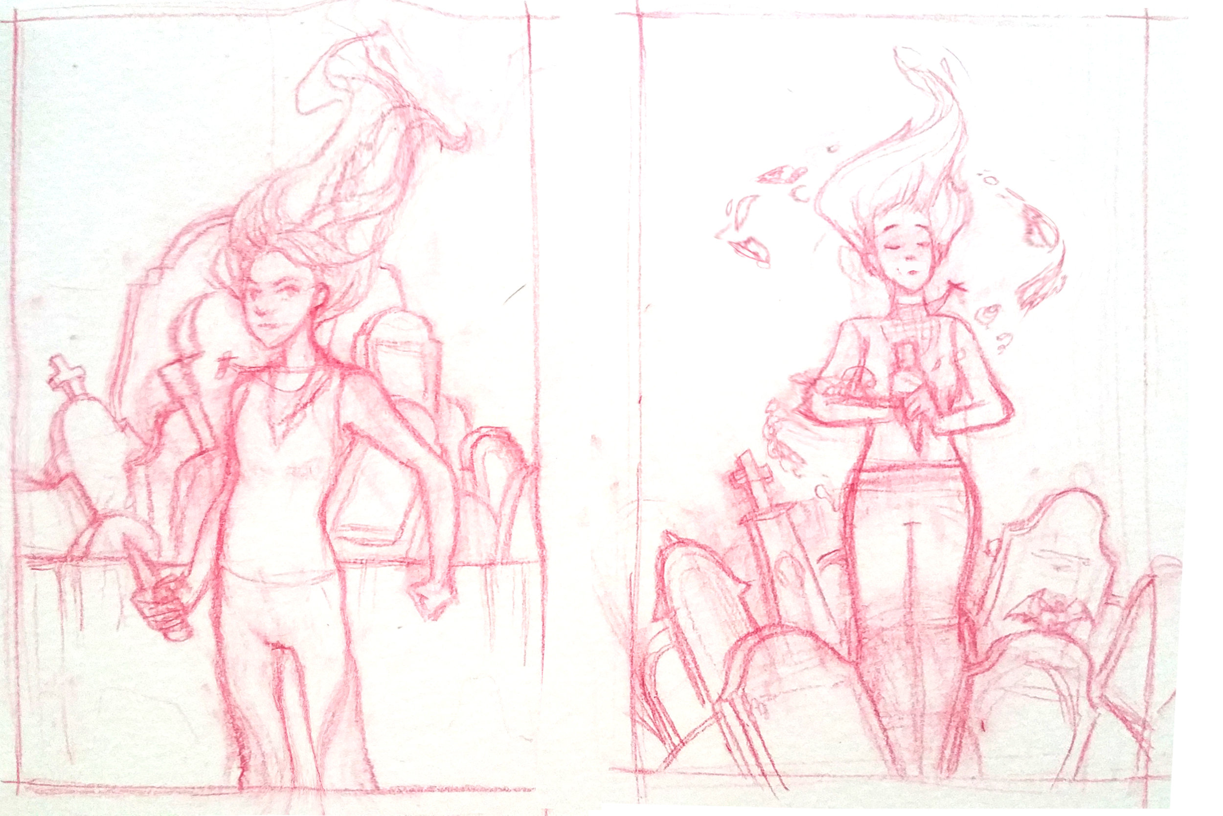
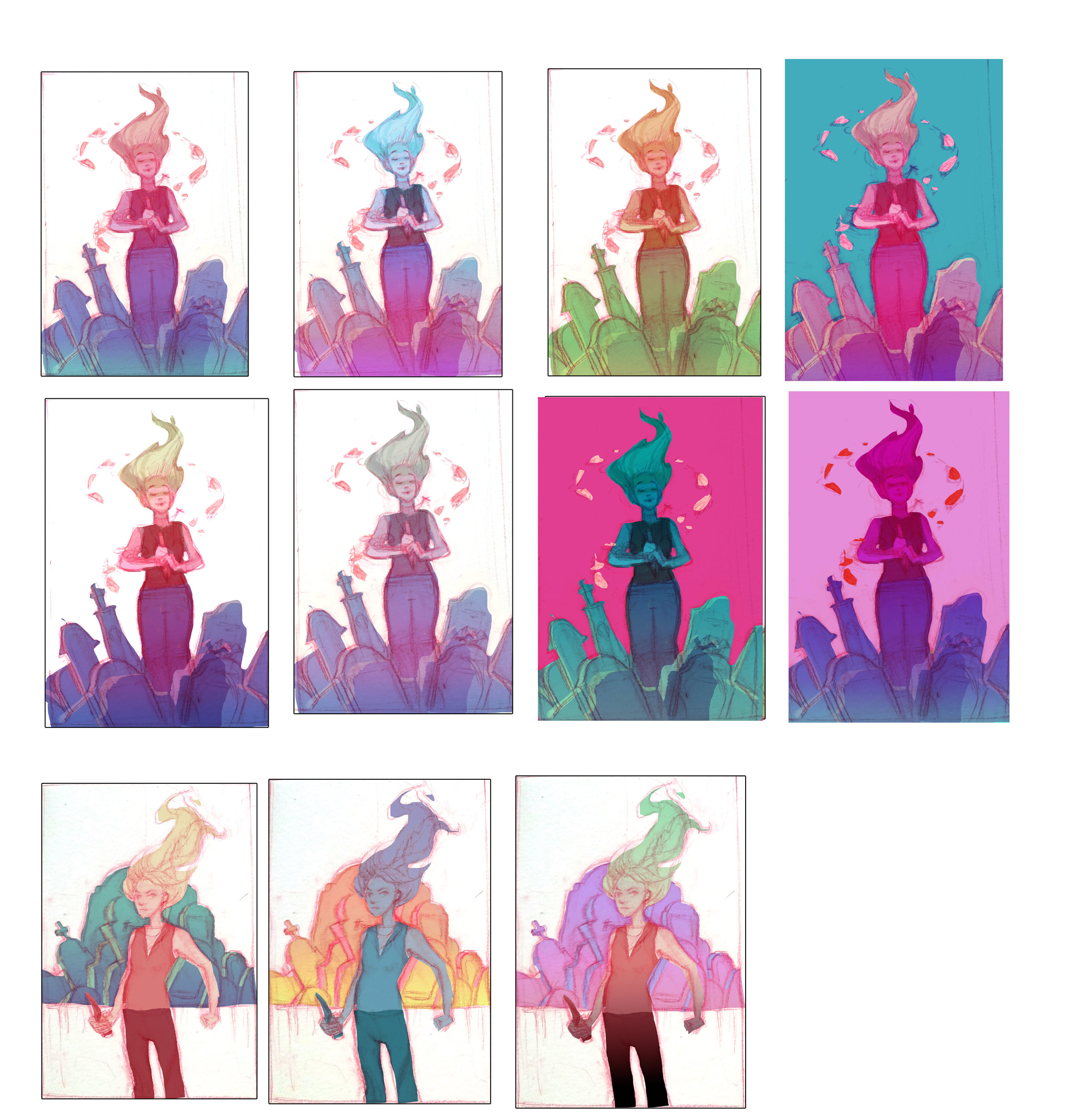
Our final class assignment for SmART school was a cover for Buffy the Vampire comic series. I saw the tv series when I was younger and really liked it. Because Buffy isn't a character I would normally paint, I decided to have fun with it and push the colors as far as I could! Usually I stick more to local colors and focus on the overall concept. Here is the process I went through for the assignment:

Rough thumbnail sketches:

Color variations:

Final images with two color variations. The more realistic colored one (left) was my first pass, and then I used color adjustment on separate layers to create the blue/pink variant, which I think I actually like better than the red/green one!

Lionness Rampant Book Cover Process

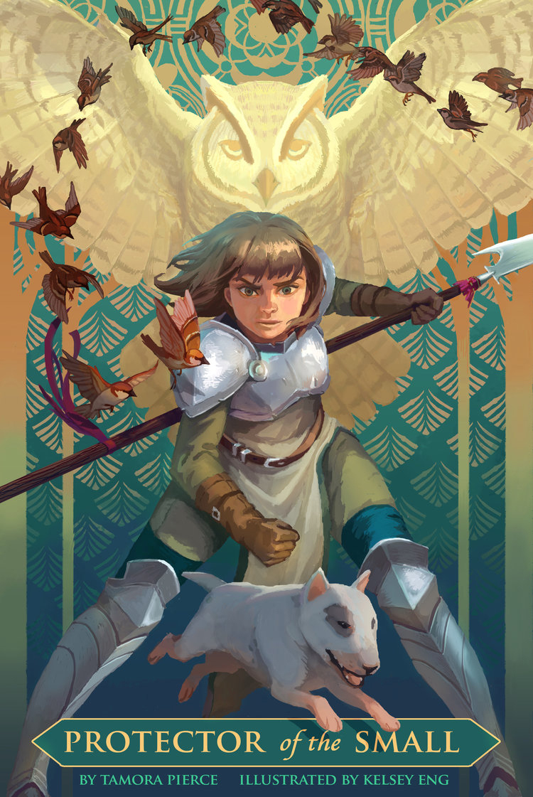
I had this project in mind for a while, to illustrate the covers for several of Tamora Pierce's novels. It's something my childhood self would love, so better late than never to do it, right? I started this project last year in late 2016 actually, but got delayed because of work and other commitments. To help me finish the project and get feedback, I enrolled in SmART School, which is an online teaching school by illustrators. I ended up taking Scott Fischer's class after asking Rebecca (the founder of the school) to take a look at my portfolio and which class I should take. I'll talk about the school in a later post, so this one will just focus on the process of creating the final image. 

Plot sypnosis: Alanna becomes a knight-in-training in the kingdom of Tortall. The twist is, she has to pretend to be a boy because women aren't allowed to be knights. Alanna also knows the gift, which is like small magicks. She also has a cat bestowed upon her named Faithful, who has purple eyes. 

Visual Iconography from book: Alanna's red hair and purple eyes, Her black cat named faithful who also has purple eyes, her Lionness shield with the Lionness Rampant crest

1. Figure out the graphic composition

I had several different options for the cover- I could emphasize her fighting abilities, or the fact that a Goddess character is helping to guide her throughout the story. I decided to go with a strong pose in either C or D. A was too Joan of Arc-y for me, B the silhouette wasn't dynamic enough. In E the silhouette was too dynamic and was too complicated to go with the rampant lion silhouette in the background. I ended up choosing the color variant C because the white lion silhouette and her dark armor contrasted nicely, our eyes just go straight to her face.

Different B&W compositions with Alanna and Faithful

2. Inspiration Board

Inspiration Board for color comps: Jody Lee, Jessica Shirley, Kid Chan/Jody Lee, Kid Chan, Victor Nizovtsev

I usually create an inspiration board for the piece I want to do before actually starting it. It's a combination of existing illustrations and lots and lots of photo references. 

3. Color Comps

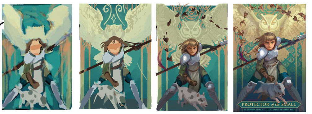
Color comps for the trio of book covers 

I had to think about the colors for the book covers as a set, I wanted each to have a different color theme to differentiate them from each other. Seeing all three together also helped me establish the theme of animal silhouette tapestry behind the heroine of the book.  I eventually went with #2 (bottom left). 

4. Painting Process

While painting, I like to reference how other artists handle the same subject matter. Here are some of the references I had: medieval armor designs, Krenz Cushart, Otat, Ahmed Aldori, Fire emblem armor designs, more medieval armor.

Witchy From Bhutan Process

1. Line drawings - (I thought of the three poses on the left first and based the right most one off of them).

2.  Adding local color - Started to add color on a Multiply layer to figure out the composition. It is great if I have the anatomy figured out at this stage, but the gesture is what's most important.

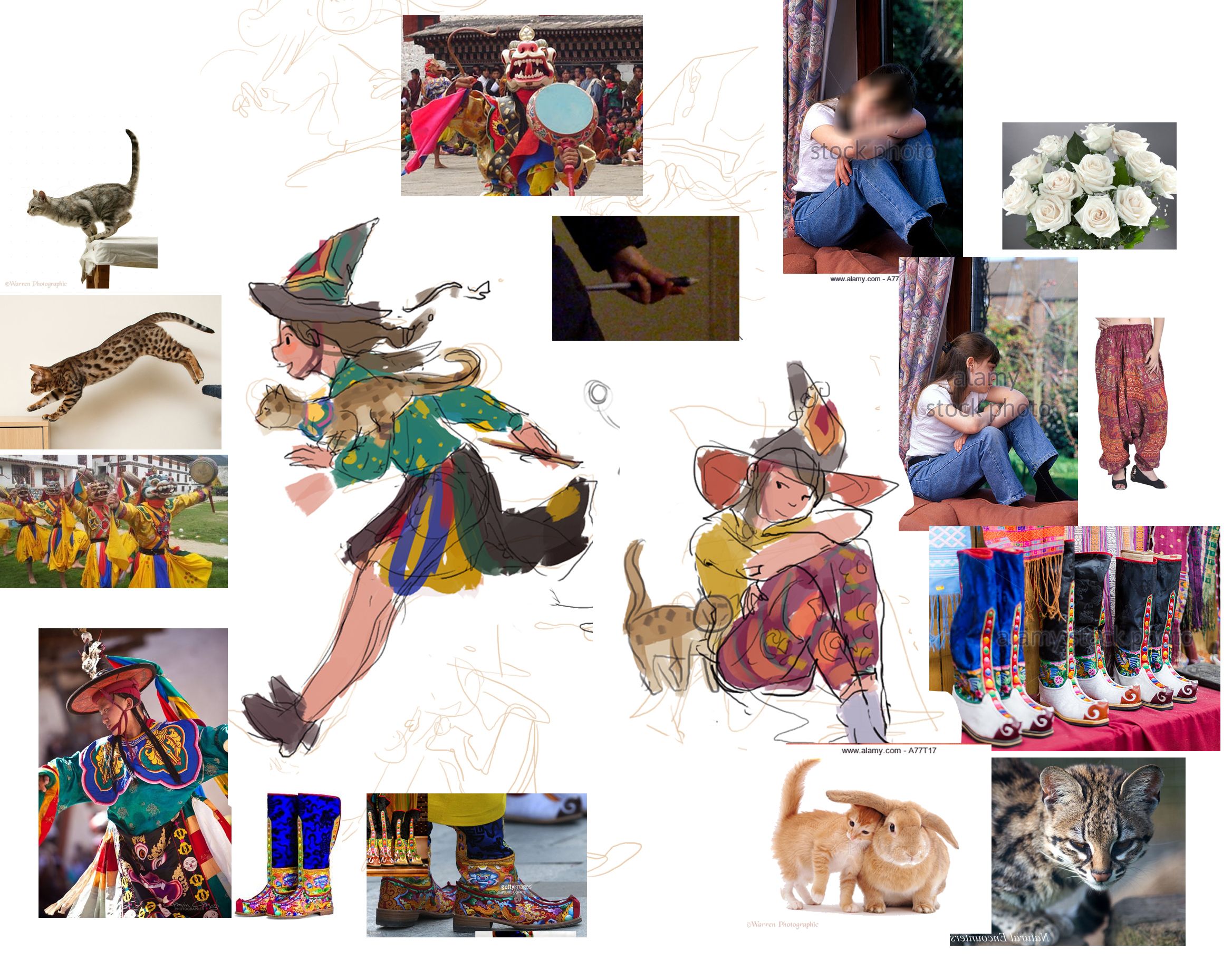
3. Build a library of reference images - At this point (or even before) I grab photo reference from the internet and have it scattered around my photoshop document. Not all of them will be useful, but it's helpful to have a lot in case you need to change direction. 

4. Then the next steps are just continue to refine and add paint. I might make a gif of one of the witchies, stay tuned :)